The Naming Test (With Flowers Doing the Dirty Work)
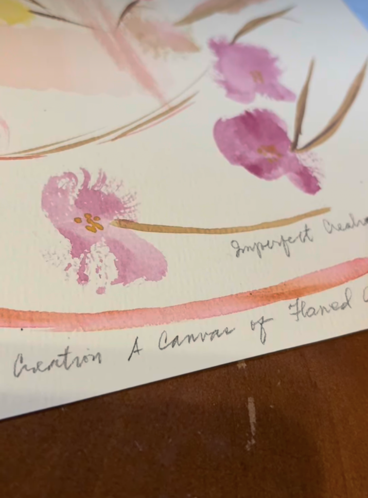
This looks like soft watercolor florals. It is. Kind of.
This page was my scratchpad for two tests: watercolor control and the name that became ACFA Creative House.
It’s also a behind-the-scenes snapshot of how it actually gets born: not from a lightning bolt, but from a slow, slightly obsessive testing loop where you’re trying to make sure the thing won’t fall apart the second real life touches it.
At the time, real life was loud. I was dealing with health stuff again, so I needed a task I could actually control. Something that wasn’t a scan, a bill, or a countdown. So I built a small lab on paper.
The doodling wasn’t “doodling.” It was testing.
First test: materials.
What happens when the brush meets water, when pigment blooms, when color bleeds past the polite edges. Watercolor is basically a collaboration with chaos, which is useful when you’re trying to feel steady while your body is doing its own thing.
Second test: identity.
What words could hold the future?
This is the part nobody sees when they admire the finished brand name: the quiet mental work of trying to pick something you won’t abandon later. Something that can expand as the work expands.
Something that can carry essays, panels, photography, process notes, failures, wins, and whatever new lane shows up next without needing a rebrand every time your life evolves.
It started as A Canvas of Flawed Art.
That was the honest version. The unpolished thesis. The one that admitted the work would be human.
Then it tightened into ACFA because names, like paintings, need structure. They need to fit in small spaces. They need to be repeatable.
Then the next realization landed: a canvas alone is not a system. A canvas is a surface.
A surface needs a home. But the home needs a solid foundation.
A home implies continuity, output, purpose. Not just “art,” but a place where the making is housed, kept, organized, and allowed to mean something.
That’s how ACFA Creative House was born.
So yes, the flowers are pretty. But that wasn’t the job.
The job was building a name that could carry forward.
A name you wouldn’t discard when it stopped being convenient.
A name sturdy enough to hold what you make, even when you’re not at your steadiest.
This page is what it looks like when creation is both process and coping, without making a big dramatic speech about either one. The health context is there, quiet in the background, like weather.
The foreground is the work: brush, water, pigment, and a name being tested until it could stand up on its own.
This is what starting looks like when you don’t have extra energy to cosplay as inspirational.